
Hello everyone,
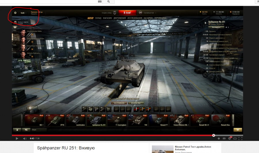
as you already know from yesterday’s patchnotes, in 9.3, we will get new (simplified) hangar interface (specifically the upper part). Here’s how it’s going to look. Note the reworked upper bar.
Hello everyone,
as you already know from yesterday’s patchnotes, in 9.3, we will get new (simplified) hangar interface (specifically the upper part). Here’s how it’s going to look. Note the reworked upper bar.
personally i dont like it
First :P -edit: Not first :(
But seriously.. they didn’t have enough space anymore? I don’t follow
haahhahah your not first hahaha
haahhahah you’re* hahaha
Meh i grow up on the old 1 so i don’t really like this 1 :/
And note the competition on bottom to win free Nissan Patrol; make 100000exp in 74 sec.
Looks similar to the UI in World of Warplanes. They said something about making the UI’s across all three games somewhat the same, if not identical for some elements. The ”form a platoon” button is a welcome change for me.
To me it all looks similar to the mobile UI, like on WoT Blitz. Very simplish and clean, but I wonder how will it work out. Hope they don’t fuck up with something, but I’m glad. UI needed some refreshing, the old one looks kinda outdated
“Hope they don’t fuck up with something…”
You must be new here. Welcome o/
I just loled! :)
Golden!
That being said, it looks nicer than the old one. Hope it retains most functionalities.
I think it’s okay. However, I still miss those two, separate buttons on the bottom-right corner of the screen…
You guys actually care?
Yes! I want eye candy, not ugly minimalistic shit!
Hope they update the filters for tanks, it’s one of my most used mod feature…
A Lot cleaner I like it a actually. Its a hell of a lot better than before.
The same UI with just some minor changes for almost three years and now this … it feels like punch in the nuts. I agree it looks way cleaner than the UI before but we are all used to the old one. This is cool just for the newbies … Guess we will have to get used to it.
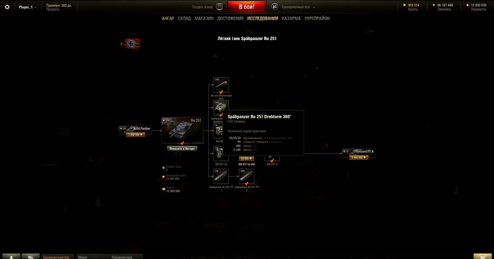
Yes! I had a suspicion the RU251 shared its top engine with the IndienPanzer.
Save the tracks and possibly the radio, it’ll be pretty much allready elite when I unlock it.
Hmm… Based on wowp theme
Sad they see the need to change the garage, but still can’t find the time to make something that sorts tanks better. I guess they figure the mods out there are better than what they can do?
Still no multirow? Why doesn’t WG use ideas from modders?
Seems like the print has gotten smaller. What is with the Russians and really small fonts? Can we have a large print version for us old folks?
Seems much cleaner and better .Welcome change.
Doesn’t the second screen kinda back up the 9.3 Preview text u corrected SS?
cause RU251 is clearly predecessor of Leopart in wot!
so whoever wrote the 9.3 preview has inside knowledge!
mfg eX
PS: being inside guy doesn’t mean u are always right about wot , as many QAs have proved. No one can know everything about WoT i guess, some may get very close, but with such “complex” (read: sometimes even fucked up) code it is nay impossible, some things should behave that way, but still do completely different things in reality, may it be virtual reality in this case.
Seriously hate this interface.. current is for WoT much better.. (please anyone make some mod of this current interface) :)
I hate this ugly simplistic shit interfaces used in most modern games, why on earth do they have to change it into something like that in WoT, too? Only thing this does for me is killing part of the immersion. I want my eye candy!
Looks like shit, hopefully modders do an overhaul on it, once WG is done making it better for us… :\ Lol.
any data on what the XP requirements for the new lights will be?
push