Source: http://habrahabr.ru/company/wargaming/blog/228309/ (via LJ user cadmi)
Hello everyone,
an interesting article was published on the Wargaming… I don’t know, blog?, about the evolution of the World of Tanks GUI. Now, it’s mostly aimed at programmers, so I hope I will get the translations right, but I think it is potentially interesting for everyone. If you spot any mistakes or wrong terms, please let me know in comments.
Also, it’s not a word for word translations, more like an excerpt of how the GUI evolved over time. The author of the post worked in Wargaming GUI Programming department for 2,5 years and wanted to sum his past experience with the GUI itself.
First Steps
The first steps consisted of using the tools of BigWorld itself. The idea of the project was born in December 2008 – the original idea was in fact to make a MMO with elves and orcs (that’s where the models from the “orc vs elves” trailer came from), but after thinking it through, the devs decided to do tanks instead. The game was made using the BigWorld engine, which had its own set of tools for creating the GUI. WG programmers followed the “easiest path” and made the first interface based on the BW tools GUI.
Technically it looked like this:
- the visual and structure part of the GUI was described in XML
- general layout for the main (large) view – the styles of the view itself and the set of main blocks, of which the view consists was also described in XML
- each of the blocks was described by a separate XML, showing the used styles and components. Each of the components had its own settings (names, localization messages, style links)
- the styles were described in separate XML files, where their sizes, positions, used textures, fonts, colors, z-order and god knows what else were defined (put in)
- when the client started, these XML files loaded into Python and were parsed, after which the process of interface creation, their initialization and connecting them to game logic began
This is an example, mined out of some SVN-project
hangar.xml – description of UI blocks in hangar
<hangar>
    <styles>
        <style>window</style>
        <style>hangar:window</style>
    </styles>
    <childs>
        <AccountBlock>
            <name>account_info</name>
            <import> components/account </import>
        </AccountBlock>
        <Fitting>
            <name>fitting</name>
            <import> components/fitting </import>
        </Fitting>
...
    </childs>
</hangar>
account.xml – description of UI blocks in account management
<account>
    <styles>
        <style>hangar:account_info</style>
    </styles>
    <childs>
        <TextLabel>
            <name>account_name</name>
            <text></text>
            <textElideMode>ElideRight</textElideMode>
            <styles>
                <style>hangar:account_name</style>
            </styles>
            <toolTip>
                <format>#tips:hangar/account_name</format>
            </toolTip>
        </TextLabel>
        <TextLabel>
            <name>account_exp</name>
            <text>#menu:hangar/account_info/experience</text>
            <styles>
                <style>hangar:account_exp</style>
            </styles>
            <toolTip>
                <format>#tips:hangar/account_exp</format>
            </toolTip>
        </TextLabel>
...
    </childs>
</account>
styles/common.xml – description of styles for common components
<style>
    <window>
        <bgcolor> 200 200 200 255</bgcolor>
        <overlaycolor> 255 255 255 255 </overlaycolor>
        <border>
            <texture>gui/maps/window_border.tga</texture>
            <size> 5 </size>
        </border>
        <focus>
            <bgcolor> 255 255 255 255</bgcolor>
        </focus>
    </window>
…
</style>
styles/hangar.xml
<style>
    <window>
        <color>0 0 0 255</color>
        <bgcolor>255 255 255 255</bgcolor>
    </window>
    <account_info>
        <position><x>10</x><y>10</y><z>0.9</z></position>
        <height>32</height>
        <bgcolor>100 100 100 255</bgcolor>
        <color>200 200 200 255</color>
    </account_info>
    <account_name>
        <height>100%</height>
        <textAlign>LEFT</textAlign>
        <position><x>10</x></position>
    </account_name>
    <account_exp>
        <height>100%</height>
        <horizontalAnchor>RIGHT</horizontalAnchor>
        <font>default_smaller.font</font>
    </account_exp>
…
</style>
Generally, everything was structured and clear, but as it turned out later, this approach had several disadvantages:
- the work with multilayer XML was hard to understand and led to large number of errors, that were hard to find and fix (for example, typos in the naming of components and texture paths, breaches in structure of XML documents)
- the lack of visual development environment – the only way to see the result of your work was to run the client and create the conditions that would display the interface part you want to see. To imagine how it would all appear by looking at the XML code was simply impossible
- poor performance when processing the user input (this was mainly noticeable in chat)
- small set of components “from the box” (SS: as in that came with Big World), while it was complicated to add new ones
- huge involvement of programmers in process of creation or changes in GUI (even minimal ones required programmer involvement)
- the lack of tools to create animations
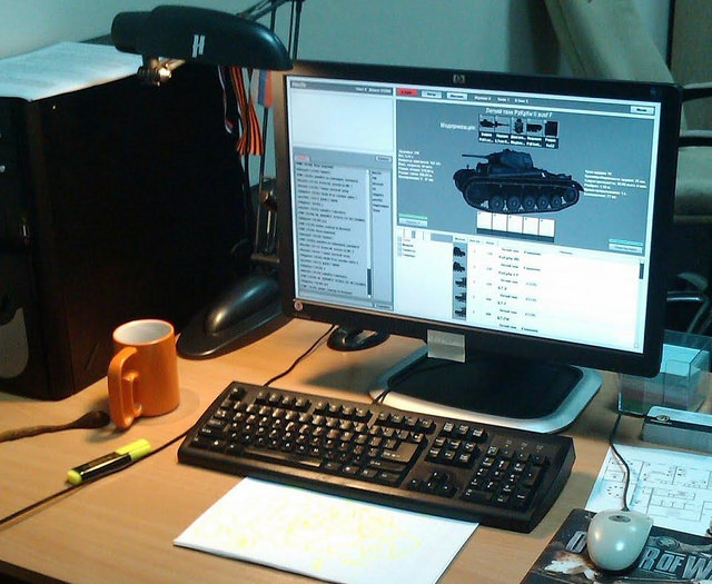
All these disadvantages led to the creation of Programmer Art style interfaces. The rough schematic outline layout was made by programmers in XML and only then did the artists create the textures needed and handed them over to the programmers for the final assembly and polishing. Here is an example of such an interface, on the picture there is a workplace of this project’s leader, Aleksander Shpilayev with the closed alpha test stage client running:
One of the first versions of new interface:
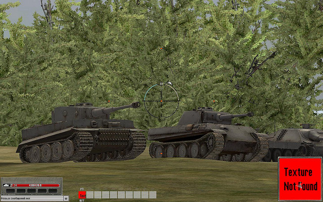
And this version came a bit later:
It became clear very quickly that this approach is a dead end. An analysis of middleware market solutions was made. As it turned out, the mainstream of GUI development at that point was the Scaleform solution: almost all of the AAA-projects used it in their development and the results looked very attractively. This was the Fall of 2009.

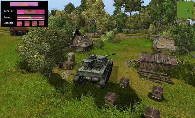
The Pz III/IV looks like on the Prokhorovka. And the vegetation looks pretty… Maybe better than now :)
The funny thing is… Those models can be mined and used by other people :>
The vegetation is pretty much the same, it’s just that they set the lighting much brighter and the saturation higher.
I still miss being able to run over the doghouse :/
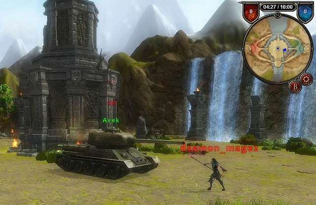
What I want to know how that T-34-85 dealt with the demon mage. The demon mage has agility but very likely weak pen/high dmg. The gun loads too slow for this fight. If not careful that demon mage will do a circle of death and kill you.
LMAO srsly :D xD
Interesting. I’ve been working on even worse environment and toolset, where in a MOBA (DoTA-like) game we were developing, all the user interfaces are hand-written, hard-coded, in a very ancient way (think about MFC). To adjust the position of any piece of UI component, you need to change the code, compile, launch the game to see the result and edit the code again, go back and forth for many times to make it pixel perfect. That was a nightmare. In the lifetime of the development stage, not any markup techniques are used to describe the UI. A UI editor? Forget it.
Luckily in the sequel of that game, people decided to employ the Unreal 3 engine, thus Scaleform became a natural choice. Not a most modern UI framework I’d say, but it’s the industry standard.
ah, the olden days before I joined when the Panther had the 75mm L/48 to mount
Pingback: World of Tanks Game User Interface Evolution – Part II | For The Record